
Contents
- Buying Guides Reduce Decision Paralysis
- Customer Reviews Tap Into the Wisdom of Crowds
- Educational Content Replaces Uncertainty with Confidence
- Authority Cues Provide Reassurance About Credibility
- Location-Based Search Makes Services Feel Closer to Home
- Frequently Asked Questions Remove Last-Minute Doubts
- Wrap Up
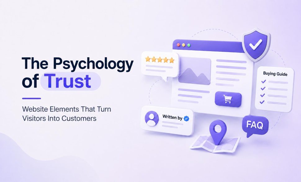
The Psychology of Trust: Website Elements That Turn Visitors Into Customers
Think about the last time you hired a contractor for a big renovation. You didn’t decide after one glance at their van. You read reviews, checked their license, asked for references, and maybe called a past client to hear how the job actually went.
Each step added a little more certainty before you signed anything.
Buying from an unfamiliar website works the same way. Visitors don’t hand over their card details on instinct. They click through your blog posts, hunt for quick answers, read a few reviews, and check whether your claims sound like something a real company would write.
Trust builds through that quiet research process, one confirmation at a time. Below are the specific website elements that answer a visitor’s unspoken questions during that process, and why each one moves people closer to buying instead of closing the tab.
Buying Guides Reduce Decision Paralysis
A shopper facing twelve nearly identical products with similar specs often does nothing at all. Too many options with too little context lead to decision paralysis – the brain freezes rather than commits, and the visitor leaves without buying.
A well-built buying guide fixes this. It narrows the field, explains what actually matters in the purchase, and gives visitors a clear path to a confident choice.
Good buying guides answer questions a shopper would otherwise have to research elsewhere: What separates a good option from a great one? Which features matter for specific use cases? How do the top choices stack up against each other? Answer these on your own site, and you keep visitors engaged instead of sending them off to compare products on a competitor’s page or a forum thread.
To build one for your brand:
- Outline the two or three factors your customers care about most, whether that’s price, durability, size, or compatibility.
- Lay out your top picks in a simple comparison format and explain the trade-offs in plain terms.
- Label each pick by the specific shopper it’s for, rather than ranking everything on one generic scale.
- Skip the marketing language and stick to facts a shopper can act on.
A page that does all four badly still looks like a buying guide. A page that does all four well is the difference between a visitor bouncing to a competitor’s roundup and a visitor staying on your site through to checkout, which is the same logic behind our own comparison-style plugin roundups: each pick is labeled by the specific problem it solves, not ranked on one generic score.
Customer Reviews Tap Into the Wisdom of Crowds
Before people trust an unfamiliar business, they check what other people already think of it. This is the wisdom-of-crowds effect at work – individual shoppers feel more confident making a decision when they see a pattern of agreement from others who’ve already made that choice.
A single glowing product description written by a brand carries far less weight than ten strangers saying the same thing independently. Reviews and testimonials give visitors that same collective signal, and it does more to move a purchase decision than almost anything else on a page.
41% of consumers say they always check reviews while browsing for a business. That’s a huge share of your traffic actively looking for this kind of proof before they’ll even consider buying from you, and it’s a big part of why reviews move the needle on conversions in the first place. Skip reviews entirely, and you’re asking a large chunk of visitors to take a leap of faith most of them aren’t willing to make.
To put this to work on your own site:
- Collect reviews systematically rather than hoping they show up on their own.
- Ask customers directly after a purchase, and make leaving feedback quick and simple.
- Display reviews near the products or services they actually describe, not buried on a page visitors rarely find.
- Layer your proof. A star rating tells visitors what people think on average; a named review with a date and a specific detail tells them the rating is real. SocialPlug stacks both on its homepage, pairing an aggregate rating with individually dated customer reviews and a live feed of recent orders being fulfilled, so a visitor can verify the same claim from more than one angle before they ever reach checkout.
- Don’t hide occasional negative reviews. A mix of feedback reads as far more genuine than a suspiciously perfect record.
Educational Content Replaces Uncertainty with Confidence
Uncertainty stops people from buying more often than a high price tag does. When a visitor doesn’t understand what they’re purchasing or why it matters, they hesitate, leave the tab open, and often never come back.
Clear, well-written educational content fixes that. It shows visitors you know your subject inside and out, and turns a confusing purchase into one they feel equipped to make on their own. Sites that publish educational content see visit rates climb by 17%, since visitors come back for answers and often explore other pages while they’re there, the same reason educational content keeps customers coming back long after the first purchase.
People want to genuinely understand what they’re buying before they commit, and a brand willing to teach them earns a level of trust a sales pitch can’t.
To put this into practice:
- Find the questions people actually ask, whether they show up in support tickets, sales calls, or reviews.
- Answer them in plain, thorough articles rather than short marketing blurbs.
- Skip jargon unless you define it clearly, and use comparison tables wherever a decision involves trade-offs.
- Cover the whole picture: how something works, who it’s actually for, and where it falls short compared to the alternative. DialMyCalls does this well in its guide to AI phone answering services, breaking the technology down layer by layer and running a straight, honest comparison against a traditional receptionist instead of only listing benefits.
- Treat every piece of educational content as a chance to prove you understand your industry better than your competitors do.
Authority Cues Provide Reassurance About Credibility
Readers know that some information carries higher stakes than others. When the topic involves health, finances, or legal matters, most visitors can’t verify the facts on their own – they have to trust the source instead.
Authority cues like listed author credentials, accredited reviewers, or clear editorial oversight give readers a reason to extend that trust. These signals tell visitors that someone qualified stands behind the content, which matters most when the accuracy of what they read carries real consequences. Getting bad advice about a minor purchase costs little. Getting bad advice about a medical condition or a legal situation costs far more, so people look harder for proof that what they’re reading holds up.
To apply this on your own pages:
- List the credentials of the people who write or review your content, especially for topics tied to health, money, or law.
- Bring in a qualified expert to review sensitive pages, and label that review clearly and visibly, not buried in a footer.
- Add a visible “last updated” date so readers know the information hasn’t gone stale.
- Cite your sources and link to them, so readers can check the claims themselves instead of taking your word for it.
None of this needs to be elaborate. A named author, a dated review, and a linked source do more for credibility than any badge or seal you could design, and the same logic applies to the legal pages on your own site: a visible, properly maintained privacy policy and terms page is itself an authority cue, it tells visitors you take their data and their purchase seriously enough to document it.
Location-Based Search Makes Services Feel Closer to Home
Distance shapes trust in ways people rarely notice consciously. A service that feels far away, vague, or nationwide can seem abstract, like it exists somewhere out there rather than somewhere real.
The moment a visitor sees an option specific to their own city or zip code, that abstraction disappears. Suddenly help feels close, available, and tied to an actual place they recognize. Location-based search taps into this directly: instead of asking visitors to sift through generic information and figure out later whether your service even covers their area, you answer that question upfront and remove a layer of doubt before it forms. It’s the same reason local listing and directory plugins build location search into the homepage rather than tucking it inside a filter menu three clicks deep.
To build this into your own site:
- Add a location search feature prominently, ideally right on your homepage where visitors see it immediately.
- Let people search by address, city, or zip code, not just a dropdown of regions.
- Return results that are specific and current rather than a generic list of areas you claim to serve.
- Keep the process fast. A slow or clunky search tool undercuts the reassurance you’re trying to create.
Frequently Asked Questions Remove Last-Minute Doubts
Right before someone commits to a purchase, a small worry often creeps in. What if this doesn’t work for my situation? What happens if I need to cancel? Is there a catch buried somewhere in the fine print?
These questions rarely stop a visitor from browsing, but they can absolutely stop them from clicking buy. A well-built FAQ section answers these doubts directly, and that honesty does more to close a sale than any amount of persuasive copy.
FAQs work because they mimic a conversation. When a business anticipates a visitor’s specific concern and addresses it plainly, without dodging or vague language, it signals confidence and transparency. Visitors read that as a sign the company has nothing to hide, which makes the decision to move forward feel a lot safer, the same reason a good helpdesk setup catches these questions before they ever reach a support ticket.
To build an effective FAQ section:
- Gather the actual questions your customers ask through support emails, live chat, or sales calls, rather than guessing at what might matter.
- Write answers that are specific and complete, not vague reassurances that dodge the real concern.
- Address the failure cases directly. Uproas answers exactly this kind of question on its Google Ads agency account page, spelling out what happens if an ad gets disapproved, whether a customer can run multiple accounts at once, and how much control they keep over their own campaigns, the specific worries a buyer would have right before committing to a service built around account access.
- Use a collapsible format so visitors can scan the questions and open only the ones relevant to them.
Wrap Up
Trust rarely comes from a single bold design choice. It builds through a series of small, deliberate decisions:
- buying guides that simplify hard choices
- reviews that back up your claims from more than one angle
- content that teaches instead of only sells
- credentials that back up your expertise
- search tools that bring your service closer to home
- answers that clear up doubts before they turn into hesitation
Each element on this list works because it answers a question your visitor already has, even if they never type it into a search bar.
Look at your own site through that lens. Find the moments where visitors might pause, and give them the information they need to keep moving forward. Small, specific changes like these add up to a site people feel genuinely comfortable buying from.



Leave a Reply
You must be logged in to post a comment.