The plugin has two Layouts available.
- Carousel
- Grid
Each of the above layouts has separate settings as well as some identical general and style settings. Let’s check the general settings first.
The indicated settings in the following screenshots are similar for both grid and carousel sliders.

General Settings
- Layout: The option lets you choose the type of slider you want to add(Carousel/Grid).
- Select Theme: For both carousel & grid settings, you will get to choose from 15 default themes. (3 Free and 12 Pro)
- Total Products to Display: You can specify the number of products you want to show in the slider.
- Display Header: You can choose to hide the display header. By default, the header title will be visible on top of the slider.
- Header Title: If you want to set a text which will be visible above the slider then you have the option to write your own text here.
- Header Position: This option is to let you pick the header position. The position can be center, left, or right.
- Display Product Title: You have the freedom to display/hide the product title as well. It can either be set to “yes” or “no”.
- Product Type: This is the main part from where the products are fetched on the frontend slider. Each of the product types has different options. Below is the visual representation:

- Display “Sale” Badge: On the product image, sale badge can be shown or hidden using this setting. You can also edit the badge text and set a position of it. The following screenshot is the frontend view of this setting:

- Display “Featured” Badge: The functionality is similar to the sales badge. You can set your own badge text as well as the position of the badge.
- Display the “Sold Out” Badge: Sold out badge works in the same manner as the previous two options.
- Display the “Discount” Badge: Discount badge works in the same manner as the previous three options.

- Product Price: In the above screenshot, the product price can be seen below the product name. If the “no” is selected then the product prices will be invisible.
- Ratings: Similarly product ratings will be invisible if “no” is selected here.
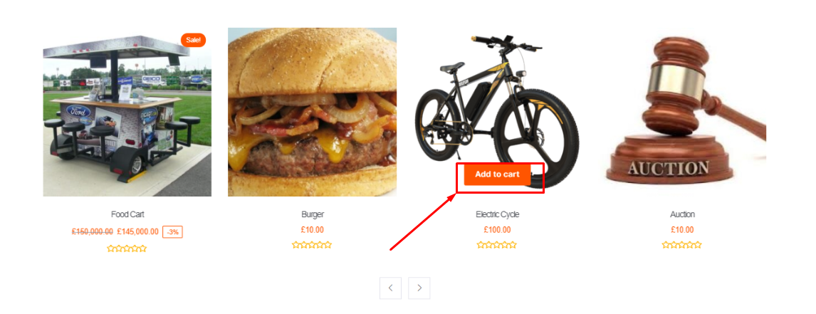
- Add to Cart Button: Hovering over a product image makes the “Add to cart” button visible. If no is selected then the button will be disabled. For visual reference check the following screenshot:
- Image Resize and Crop: The slider might look very unappealing if the product images are of different sizes. In that case, image resize and crop feature can be very handy. It will take out the hassle of editing the media files.
- Image Height & Width: You can manually set the image height/width here which will be used during image resizing and cropping.
Pro Settings
Some additional settings will appear if you are using the PRO version.
- Quick View: If “yes” is selected then hovering on the product image there will be a quick view option. Otherwise, the quick view button will be invisible.
- Text for Quick View Button: Set your own text for the quick view button using this option.
- Add to Wishlist Button: Identical to the last two options. You can either choose to show the “Add to wishlist” option or you can choose to hide it. All these three options show up while a client hovers over a product image in the slider.
- Visibility of Sold Out Products: By default, the sold out products will be excluded from the slider unless you choose no here.